Alfra®
Alfra is a leading manufacturing brand operating across 14 countries. With a massive physical inventory of 300+ visual communication and organizational products, their digital presence required a highly scalable architecture. I overhauled their web experience, transforming a vast physical catalog into an intuitive, responsive digital showcase.


Scaling Complex Digital Product Catalog
My Role: UI/UX & Website Designer
Collaborators: Developer & Project Manager
Responsibilities: User & Market Research, Information Architecture, UI/UX Design, Responsive Prototyping
Tools: Adobe XD, Photoshop, Illustrator
Core Challenge
Alfra’s legacy site faced two structural roadblocks:
-
Catalog Scale: Managing over 300 products spanning dozens of distinct categories made digital product discovery overwhelming without a transaction engine.
-
Fragmented Audience: The site had to serve three distinct user tiers simultaneously: corporate buyers researching bulk items, school administrators planning institutional setups, and retail consumers browsing home-office supplies.
Goal
Build a unified user experience that streamlined a massive inventory into a lightweight, highly discoverable digital catalog that routes users to the right solutions.
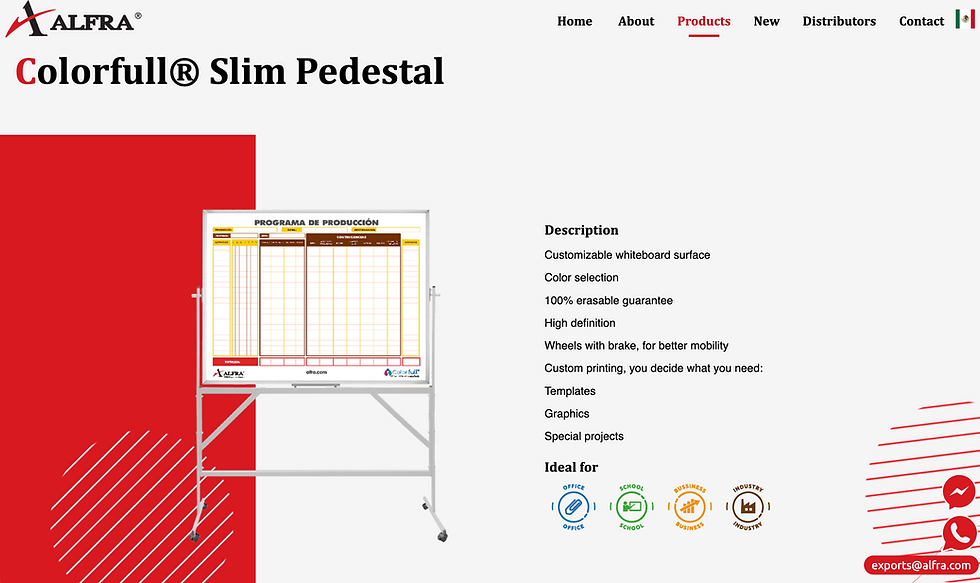
Product Details View

Category Type View
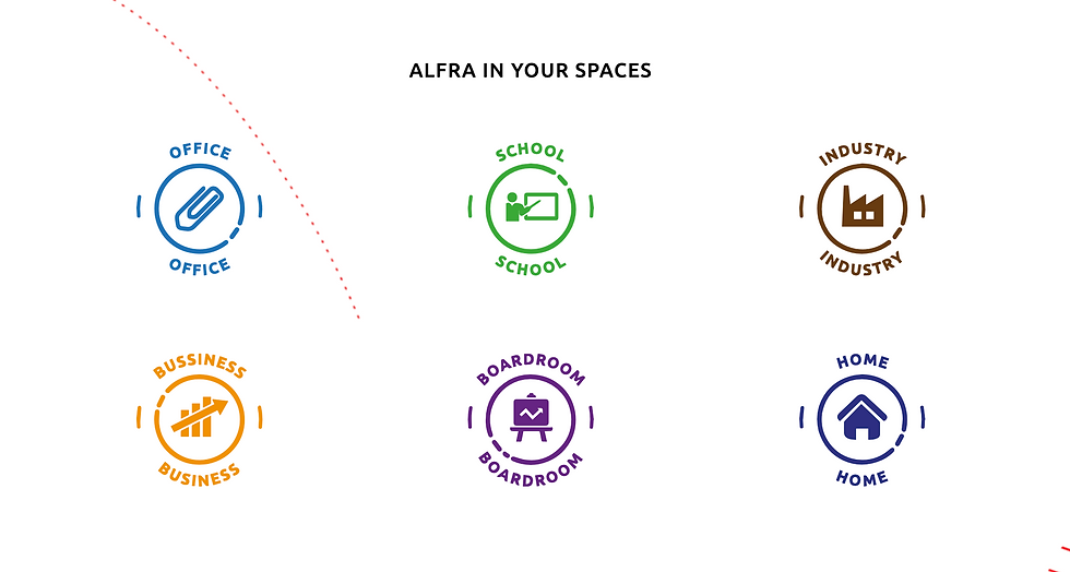
Environment Type View

Micro-Animations
Research & Strategy
-
Benchmarking: Research revealed that competitors relied on sterile, "sober," and text-heavy traditional catalogs.
-
Opportunity: Position Alfra as a modern, dynamic industry leader by introducing vibrant color theory, purposeful motion, and high-impact visual storytelling while maintaining strict corporate navigation standards.
Information Architecture
To make the 300+ product catalog effortless to browse, I designed a dual-path navigation:
-
By Environment: 6 contextual use-cases (Office, Home, School, Boardroom, Industry, Business).
-
By Product Family: Specific hardware types (Whiteboards, Kids, Tech Boards, Furniture, Drafting Tables).
UI Design & Visual System
-
Environmental Branding: Assigned a unique icon and color profile to each of the 6 environments to eliminate cognitive overload.
-
Micro-interactions: Injected fluid animations to make browsing a heavy corporate database feel lightweight, modern, and interactive.
Results & Business Impact
The redesign was a major success for both the brand and its distributors. By modernizing the interface with smooth micro-animations and a purposeful color system that stayed true to brand guidelines, the platform completely outpaced traditional, text-heavy competitor catalogs. Structurally, the new dual-pathway navigation simplified product discovery, making it much faster for potential clients to find item details. As a result, global sales teams found it significantly easier to showcase the inventory, driving a substantial lift in digital customer inquiries and catalog engagement.